Status Indicator Overview
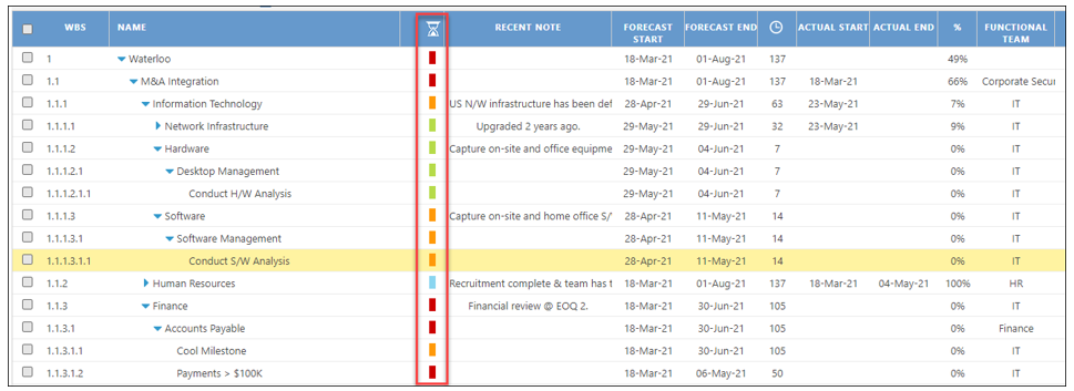
One of the salient features of the Activity Map is the status column which displays Activities that are on schedule, at risk, delayed or closed. This allows the user to immediately gauge their Activities and manage them in an efficient and effective manner.
Activity Map of the Waterloo Integration
Status Legend

Understanding the triggers of when the status of an Activity changes is explained in the below table.
Forecast and Actual Date Matrix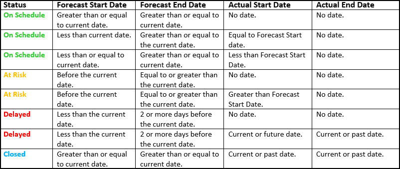
Administrator Notes:
Within the Admin/Application Settings, in the Other settings section, there is the ColorizationStrategy field with three (3) choices that are described below. It is recommended to use the default setting, however, if there is a need to use a different strategy for status calculation, please be aware of the impact in the Activity workplan before any changes are made.
- ForecastAndActual – "At-Risk" notifications are calculated by the difference between the Actual and Forecast dates. When the difference is > 1 day, then the status color will be changed to orange, which reflects "At-Risk."
- ForecastAndActual – 7DaysCheck – This is the default setting and recommended option used by most users. "At-Risk" notifications are calculated by the difference between the Forecast and Actual dates. If the difference is > 7 days, then the status color will be changed to orange, which reflects "At-Risk."
- PlanAndActual – 7DaysCheck – "At-Risk" notifications are calculated by the difference between the Plan and Actual dates. If the difference is > 7 days, then the status color will be changed to orange, which reflects "At-Risk."
